


.webp)
.svg)
When you have been using Webflow for a longer period and are no longer a beginner, one of the first things you should learn is the difference between PX, EM, and REM, i.e., what they mean and what their values are.
Understanding the differences between PX, EM, and REM is crucial for creating responsive designs that look great on all devices. Once you master these units, you'll have more control over your design and ensure a better user experience. This knowledge allows you to make precise adjustments that can significantly improve the visual consistency of your site. As you become more proficient, you'll find it easier to implement complex layouts and maintain design flexibility. Ultimately, this expertise will set your work apart and help you create high-quality, professional websites.
WHY KNOWING THE DIFFERENCE BETWEEN PX,EM AND REM IS MATTERS?
Why, above all, must we understand the difference between PX, EM, and REM? Not every laptop is set to the recommended resolution. Considering that the average website user ranges from 13 to 75 years old.
This is especially important for users who are 45 and older, as they may have impaired vision. The first thing they will likely do is adjust the font size in the Settings to Large or Very Large for better visibility. To ensure that the website remains user-friendly for them, it is advisable to use EM and REM units rather than PX. This is because EM and REM behave differently compared to PX, and this is the main distinction we will explore in detail throughout the text.
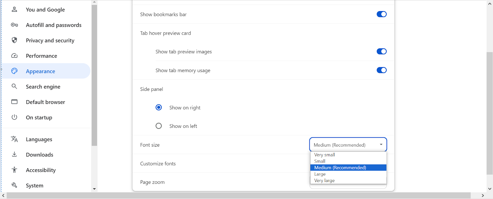
- Very Small - 12px
- Small - 14px
- Medium - 16px
- Large - 18px
- Very Large - 24px
PX- PIXELS
In Webflow, font sizes can be set using various units, with pixels (PX) being one of the most commonly used. Pixel-based font sizes provide precise control over the text appearance, ensuring consistency across different devices and browsers.
Small Sizes (10px - 14px): Small sizes like 10px and 12px are typically used for less prominent information, such as footnotes, disclaimers, and labels. They are great for text that needs to be present but not draw too much attention.
Medium Sizes (16px - 24px): Medium sizes, including 16px, 18px, and 20px, are commonly used for body text and subheadings. The 16px size is often recommended for body text as it offers optimal readability and accessibility on most devices. Sizes like 18px and 20px can be used for subheadings or text that needs a bit more emphasis.
Large Sizes (30px and above): Large sizes such as 30px, 36px, and 48px are used for main headings, banners, or hero sections. These sizes help create a clear visual hierarchy, making important information stand out and guiding users through the content effectively.
Large Sizes (30px and above): Large sizes such as 30px, 36px, and 48px are used for main headings, banners, or hero sections. These sizes help create a clear visual hierarchy, making important information stand out and guiding users through the content effectively.
By understanding and utilizing these different PX sizes, designers can create visually appealing and user-friendly websites that cater to a wide range of devices and screen sizes.
EM- Em Square
In Webflow, EM is a relative unit used for font sizes, margins, paddings, and other spacing elements. Unlike fixed units like PX, EM is based on the font size of the parent element. This means that if you set a font size to 1.5em, it will be 1.5 times the size of the font in the parent element. This relative approach allows for scalable and flexible design, which can adapt better to different screen sizes and user settings.
For instance, if the parent element's font size is 16px, setting a child element's font size to 1.2em would result in a font size of 19.2px (16px × 1.2).
We also have another example where EM is applied to its parent and to the next parent, but the Body has a base size of 20px. It works by finding the PX value and then multiplying it by each EM of its parent and each subsequent parent. For example, a Heading set to 2em, which is inside a Div set to 2em, which is also inside another Div set to 2em, and all of these are within a Body with a base size of 16px. The calculation goes as follows: 16px × 2em × 2em × 2em = 128px for our Heading.
This makes EM a powerful tool for creating responsive layouts where text size and spacing scale proportionally with the parent element. It also helps maintain consistency across various elements by ensuring that related sizes adjust together.
Using EM units can enhance accessibility because text sizes will adjust based on user preferences or device settings. This makes EM a suitable choice for web design projects where adaptability and responsiveness are important.
REM- Root em
REM is also used for font sizes, margins, paddings, and other spacing elements. Unlike EM, which is based on the font size of the parent element, REM is based on the font size of the root element, typically the <html> tag. This means that if you set the root font size to 16px, 1rem will be equal to 16px across the entire website.
Using REM units provides consistency across different elements and sections of your website, as changes in the root font size will proportionally adjust all REM-based measurements. This is particularly useful for creating a responsive design that remains consistent when users adjust their browser’s font size settings or when you need to scale the entire design up or down.
For example, if the root font size is set to 16px and you use 1.5rem for a heading, it will be 24px (16px × 1.5). This uniform scaling makes REM a great choice for maintaining a cohesive design system and ensuring that text and spacing are proportionally adjusted throughout your site.
Mastering REM units allows for more predictable and manageable scaling of your design, contributing to a more accessible and user-friendly web experience.
WHEN IS IT BEST TO USE EM AND WHEN REM?
- EM
EM is best utilized for elements like buttons, especially when setting padding. This is because EM is responsive and adjusts its size across different devices and screen sizes. For instance, if you set the top and bottom padding of a button to 1 EM and the left and right padding to 3 EM, the button will use its font size (often in PX) and multiply it by the specified EM values. Another option is to use VW (viewport width) instead of PX for size, which ensures that the button remains responsive across all devices without manual adjustments. Additionally, you can set minimum and maximum VW limits to control the button's responsiveness.
- REM
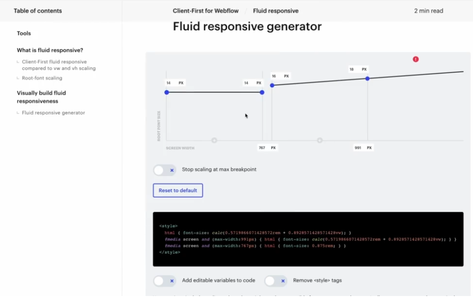
We use REM much more frequently than EM. To ensure it functions correctly and we don't have to manually adjust settings across all devices, we will need to write some code. We need to write code where we specify a certain REM size for each breakpoint. For example, for devices 992px and above (laptops), set it to 1rem; for devices between 768px and 991px (tablets), set it to 0.875rem; and for devices between 480px and 767px (wide phones), set it to 0.75rem. This way, the size for all these screens will be automatically adjusted, and we won't need to manually tweak the entire site. We can write the code ourselves or use Finsweet's assistance.
CONCLUSION - WHAT IS THE BEST?
Answer is everything.When designing with Webflow, choosing between PX, EM, and REM units is crucial for creating responsive and visually appealing websites.
- PX (pixels) offer precise control and consistency, making them ideal for fixed-size elements and detailed design where exact measurements are needed.
- EM (em square) units are relative to the parent element’s font size, making them perfect for adaptive designs where elements need to scale proportionally with their container. This flexibility is particularly useful for padding and margins, especially in responsive layouts.
- REM (root em) units are based on the root element’s font size, providing a consistent scaling method across the entire website. They ensure uniformity and scalability, making them ideal for maintaining a cohesive design system. Use REM for site-wide consistency, while EM is better for elements that need to scale with their parent containers. Both units offer advantages for responsive design, with REM offering predictability and EM providing relative flexibility. By understanding when to use each unit, you can enhance the responsiveness and accessibility of your designs. Ultimately, mastering these units will lead to more professional and adaptable websites.
.png)

.png)


.png)
.png)