


.svg)
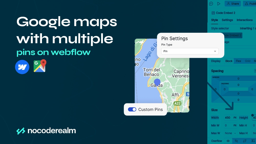
Taking your business to another level often means expanding your company to multiple locations. For example, your coffee shop is doing great, it really became famous in your neighborhood and everyone wants to sit there. The problem is that there is more demand for your coffee than you can handle, so you decide to open a few more locations in the city. Now you want to update your Webflow website, by changing your Google map on your website from showing only one coffee shop to showing every coffee shop that you own, but there isn’t any functionality that allows you to add more locations to your map. But don’t worry in this text we are going through step by step how to add more locations and customize your Google map using Atlist.
What is Atlist?
Atlist is an intuitive and powerful tool designed for creating custom maps effortlessly. Whether you are a travel enthusiast, event planner, or business owner, Atlist visually represents locations and data points on a map. The platform is tailored for users who may not have technical expertise or coding skills, making it accessible to a broad audience.
Key Capabilities of Atlist:
- User-Friendly Interface:
- Atlist offers a clean and easy-to-navigate interface that allows users to create maps without any hassle. The drag-and-drop functionality and intuitive design make the map creation process smooth and enjoyable.
- Customizable Maps:
- Users can personalize their maps by selecting from various styles, colors, and icons to match their branding or preferences. This customization extends to adding descriptions, images, and links to specific locations, enhancing the map's informative value.
- Adding Locations:
- Adding markers to your map is as simple as a few clicks. Users can input addresses manually or use the search function to find and place locations accurately. Each marker can be customized with different icons and colors to differentiate various types of points.
- Embedding and Sharing:
- Atlist makes it easy to share your creations. You can embed maps directly into your website or blog using the provided embed code. Additionally, sharing options allow you to distribute maps via social media or direct links, making it convenient to share your maps with a wider audience.
- Collaborative Features:
- For projects that require teamwork, Atlist supports collaboration. Multiple users can work on the same map, making it ideal for group projects or business teams that need to coordinate efforts in mapping out locations.
- Responsive Design:
- Maps created with Atlist are responsive and mobile-friendly, ensuring they look great and function well on any device. This feature is crucial for reaching users who may access the maps from smartphones or tablets.
- Versatile Applications:
- The versatility of Atlist makes it suitable for various applications, such as travel itineraries, event planning, real estate listings, local guides, and more. Its adaptability allows users to create maps for almost any purpose, enhancing the visual appeal and functionality of their content.
Atlist empowers users to turn geographical data into visually appealing and interactive maps. With its robust set of features and ease of use, Atlist is the go-to tool for anyone looking to create custom maps quickly and efficiently.
Map Creation
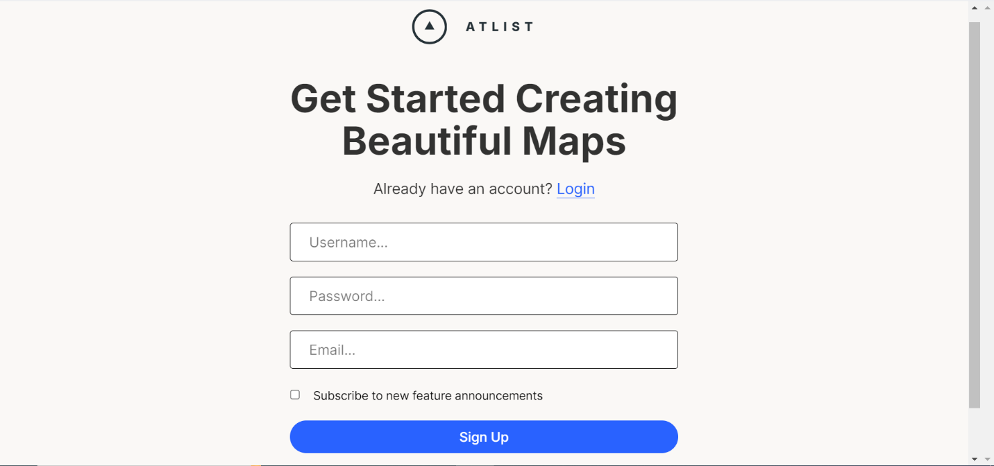
Creating an Atlist Account
Before customizing any of our maps and integrating with Webflow we’ll need to create an Atlist account. Go to sign up page and create an account. Users can start with a free 14-day trial, with no credit card required, if you find Atlist to be useful you can upgrade your account.
Building a Map
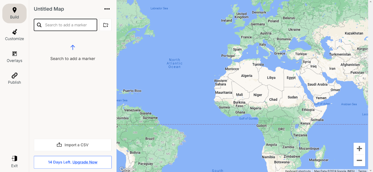
After creating an account, the next step is to build a map. In this process, we will go through step by step how to build it, how to add markers to desired locations, and how to customize the marker’s pop-up modals.
First, you are going to click on the New Map button.

Then type an address in the search bar, and you’ll see that the marker is shown on the map on the right side of the screen of that exact address. If you want to add more markers, just enter a new address in a search bar and another marker will show on the map.
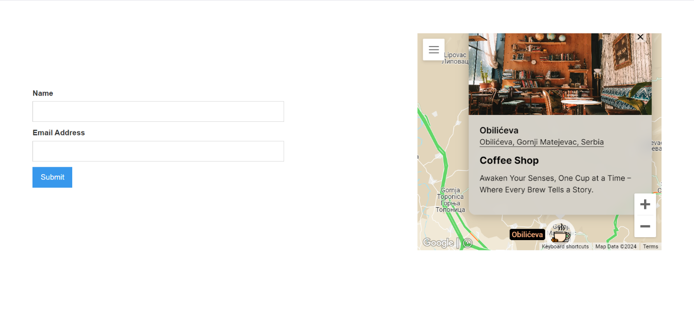
The next step is customizing the pop-up modals. When you click on the marker you’ll see multiple options:
- Change the name of the marker.
- Change the address.
- Add a tag.
- Add Notes.
- Add images.
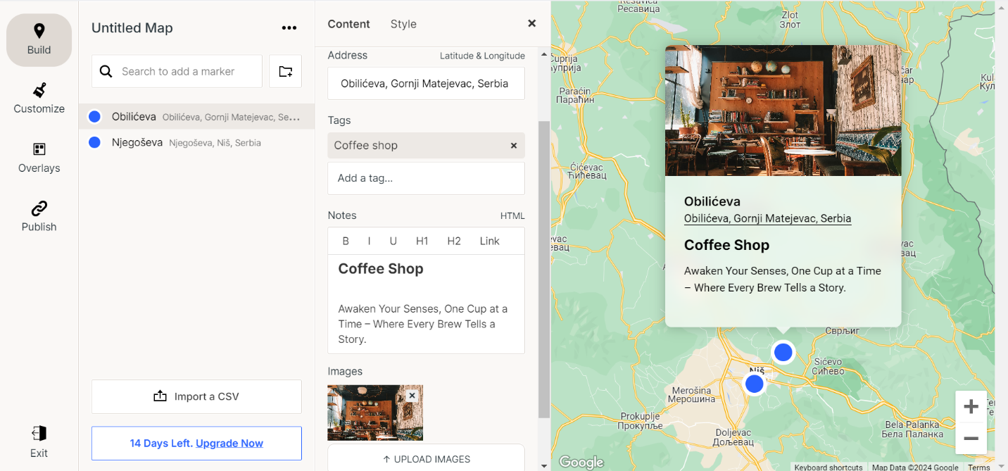
By utilizing these customization options, you can create a map that truly reflects your unique needs. For instance, changing the name of the marker can help you easily identify key locations, while updating the address ensures accuracy. Adding tags allows you to categorize markers for better organization, making it simpler to filter and find specific points of interest. The notes feature is perfect for adding detailed information about each location. Additionally, incorporating images can enhance the visual appeal and provide a richer context to your map.
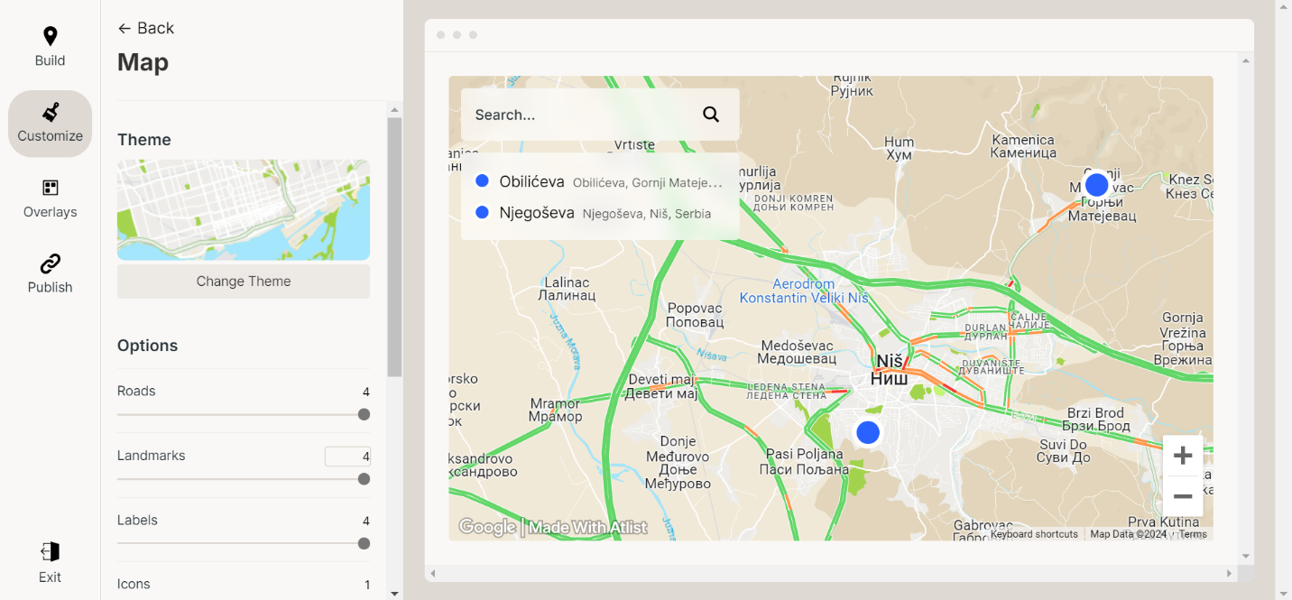
Map Customization
Customizing your map on Atlist goes beyond adding markers and pop-up details. With Atlist's array of customization options, you can create a visually appealing and highly functional map that fits your specific needs. Here’s how you can take advantage of these features:
- Map Styles:
- Atlist offers a variety of map styles to choose from, allowing you to match the look and feel of your map to your project or brand. Whether you prefer a classic road map, a minimalist design, or a vibrant, colorful layout, Atlist has options to suit your taste. To change the map style, navigate to the map settings and explore the different style presets available.
- Custom Icons:
- To make your map even more distinctive, you can replace the default marker icons with custom icons. This is particularly useful for highlighting different types of locations or adding a personal touch. Simply upload your own icon images or choose from a library of predefined icons within Atlist.
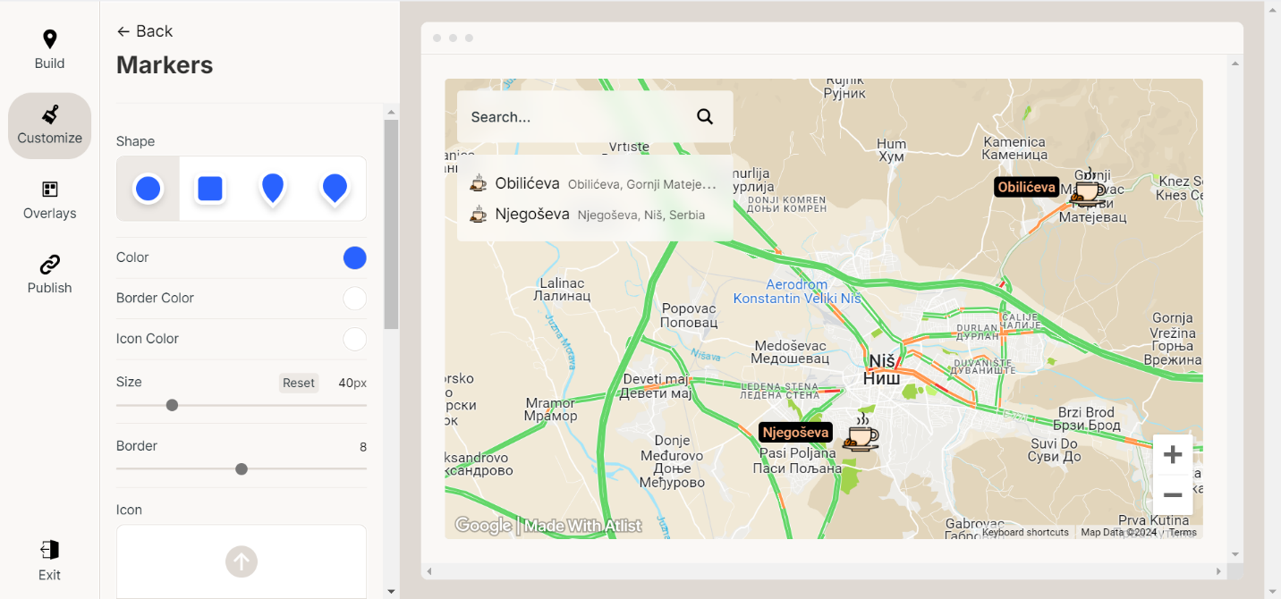
- Color Coding:
- Utilize color coding to categorize your markers. By assigning different colors to markers based on categories such as type of location, priority, or any other criteria, you can make your map easier to understand at a glance. This is done through the marker settings, where you can select specific colors for each category.
- Layers:
- Layers allow you to organize your map data effectively. You can group markers into layers based on categories, themes, or any criteria relevant to your project. Layers can be toggled on and off, giving viewers the ability to customize their view of the map according to their interests.
- Labels and Legends:
- Adding labels and legends to your map can provide additional context and make it more informative. Labels can be attached to specific markers or areas, providing brief descriptions or important notes. Legends, on the other hand, help explain the meaning of different colors, icons, or layers used on the map.
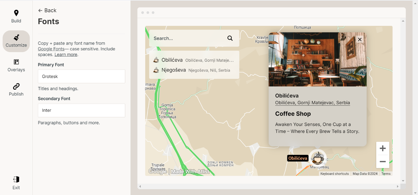
- Fonts and Text Customization:
- To ensure your map aligns with your branding, Atlist allows you to customize fonts and text styles. You can choose from a variety of fonts, adjust sizes, and apply different text colors to make your map’s text elements stand out. This is particularly useful for creating professional-looking maps that match your overall design theme.
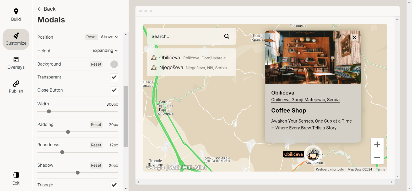
- Customizing Pop-Up Modals:
- Beyond just basic information, Atlist lets you fully customize the pop-up modals that appear when markers are clicked. You can change the layout, add images, links, and even embed videos to make the pop-ups more informative and engaging. This feature allows you to provide rich, multimedia content directly on your map.
- Backgrounds and Overlays:
- Enhance your map with custom backgrounds and overlays. Backgrounds can set the tone of your map, while overlays can provide extra information such as geographic boundaries, heatmaps, or traffic data. These can be added through the map settings, allowing you to layer multiple elements to create a comprehensive map.
By leveraging these customization options, you can transform a simple map into a powerful, personalized tool that serves your specific needs and enhances the user experience. Whether you're creating a map for personal use, business, or a specific project, Atlist provides the flexibility and features to help you achieve your goals.
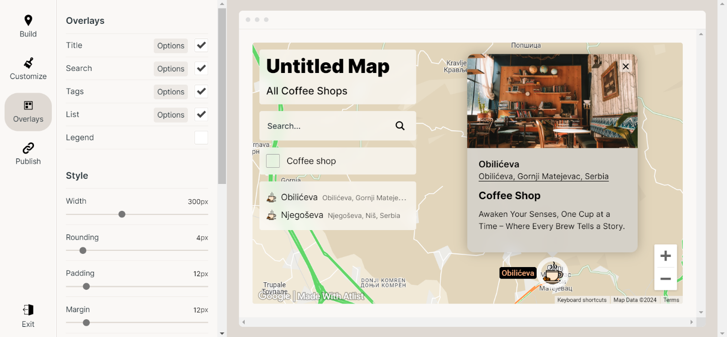
Enhancing Your Map with Overlays
One of the powerful features that Atlist offers is the ability to add overlays to your map. Overlays can provide additional layers of information and context, making your map more informative and engaging. Here’s how you can use overlays to enhance your map:
- Types of Overlays:
Atlist supports various types of overlays, each serving a different purpose. Common overlay types include:
- Heatmaps: Show areas of high activity or density, useful for visualizing data such as population density, customer activity, or areas of interest.
- Polygons: Define specific areas on the map, such as neighborhoods, districts, or zones. These can be customized with different colors and transparency levels.
- Lines and Routes: Highlight paths or routes, such as travel itineraries, delivery routes, or hiking trails.
- Markers Clusters: Group nearby markers into clusters, making it easier to visualize dense areas without cluttering the map.
- Adding Overlays:
- Heatmaps: Go to the overlays section in the map settings and select "Heatmap." You can then configure the data points that will be visualized as a heatmap. Adjust the intensity and radius to get the desired effect.
- Polygons: Select the "Polygon" tool from the map editor and draw the shape directly on the map. Customize the fill color, border color, and opacity to match your needs.
- Lines and Routes: Use the "Line" tool to draw paths on the map. You can customize the color, width, and style of the lines to differentiate between different routes.
- Markers Clusters: Enable clustering in the marker settings. Atlist will automatically group nearby markers into clusters, which expand to show individual markers when zoomed in.
- Customizing Overlays:
- Heatmaps: Adjust the gradient colors to represent different levels of intensity. Customize the opacity to blend the heatmap with the base map.
- Polygons: Label each polygon to provide additional information about the defined area. You can also use different colors for different types of areas.
- Lines and Routes: Add labels to lines and routes to describe their purpose. Use different styles (solid, dashed, etc.) to distinguish between different types of routes.
- Markers Clusters: Customize the cluster icon and colors to match your map’s theme. Configure the clustering radius to control how close markers need to be to form a cluster.
- Interactive Overlays:
- Clickable Polygons and Lines: Configure polygons and lines to show information pop-ups when clicked. This can include details about the area, route information, or any other relevant data.
- Hover Effects: Enable hover effects on overlays to provide quick information without requiring a click. This can be particularly useful for dense maps where users might want to explore data quickly.
- Combining Overlays:
- Use heatmaps to show areas of interest, and overlay polygons to define specific zones.
- Combine lines and routes with markers to provide detailed itineraries or travel plans.
- Use markers clusters with heatmaps to show overall activity while allowing detailed exploration of specific points.
- Practical Applications:
- Business Analysis: Use heatmaps to show customer density and polygons to define sales territories.
- Event Planning: Map out event locations with markers, use lines to show routes between them, and polygons to highlight different event zones.
- Tourism: Create a travel map with routes for suggested itineraries, heatmaps for popular spots, and markers with detailed information about each location.
By effectively using overlays, you can create maps that are not only visually appealing but also packed with valuable information. Whether you are analyzing data, planning events, or creating informative guides, overlays provide a versatile tool to enhance your maps on Atlist.
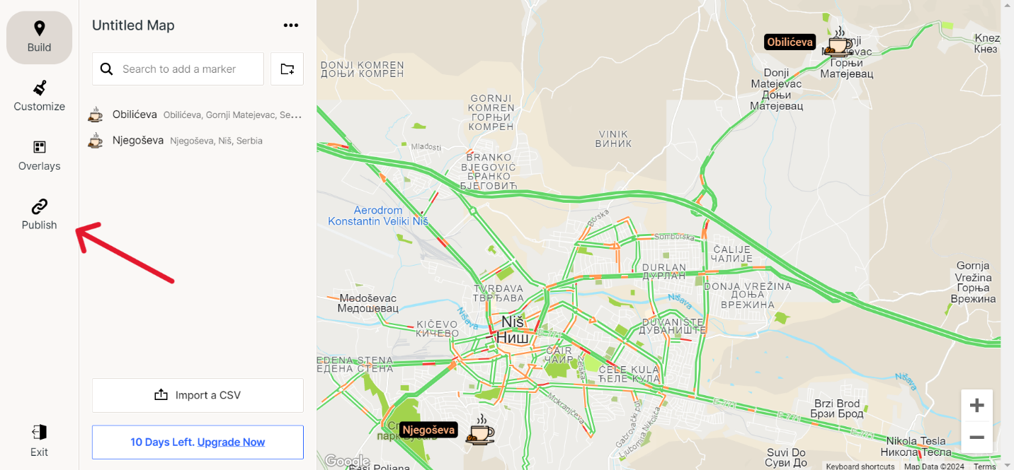
Connecting Your Atlist Map to Webflow
After creating the perfect map for your business, the next step is to seamlessly integrate it into your Webflow website. Follow these steps to embed your customized Atlist map into your Webflow project:
- Prepare Your Map in Atlist:
Before embedding your map, ensure that all markers, customizations, and overlays are set up as desired in Atlist. Once your map is ready, navigate to the publish options.
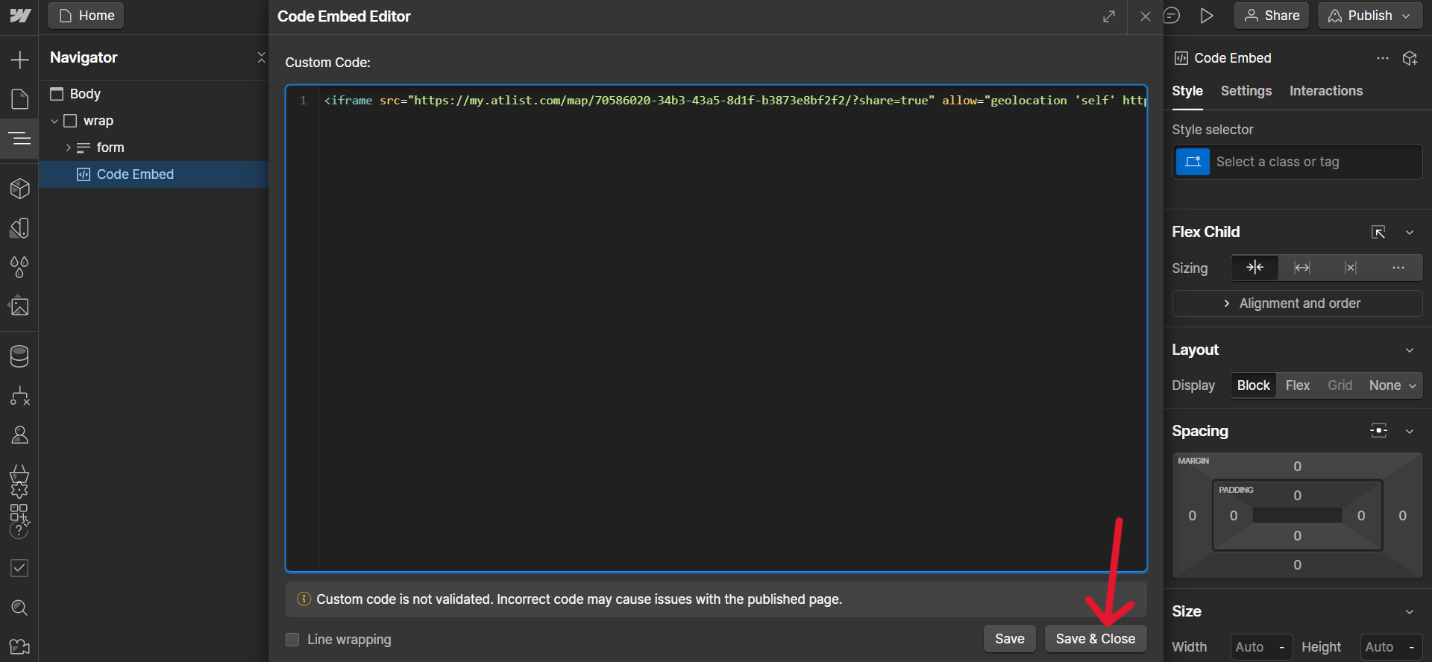
- Get the Embed Code:
In Atlist, click on the “Publish” button for the map you want to embed. Copy the embed code to your clipboard.
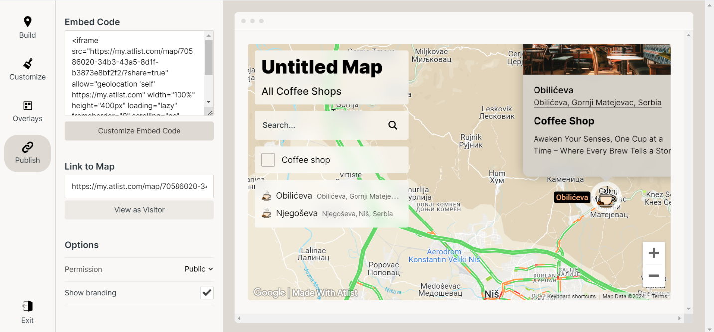
- Open Your Webflow Project:
Log in to your Webflow account and open the project where you want to embed the map. Navigate to the page or section where you want the map to appear.
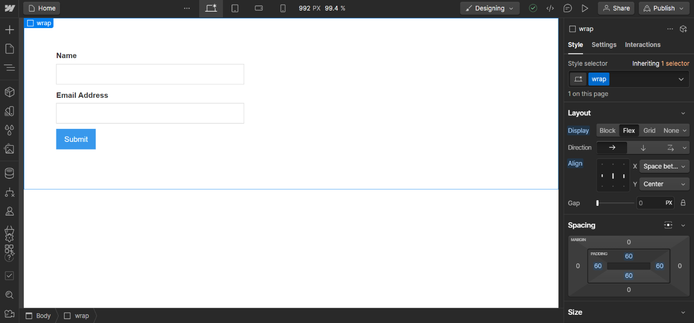
- Add an Embed Element:
In Webflow, drag an “Embed” element from the Add panel (under Components) onto your page. Place it in the desired location where the map should be displayed.
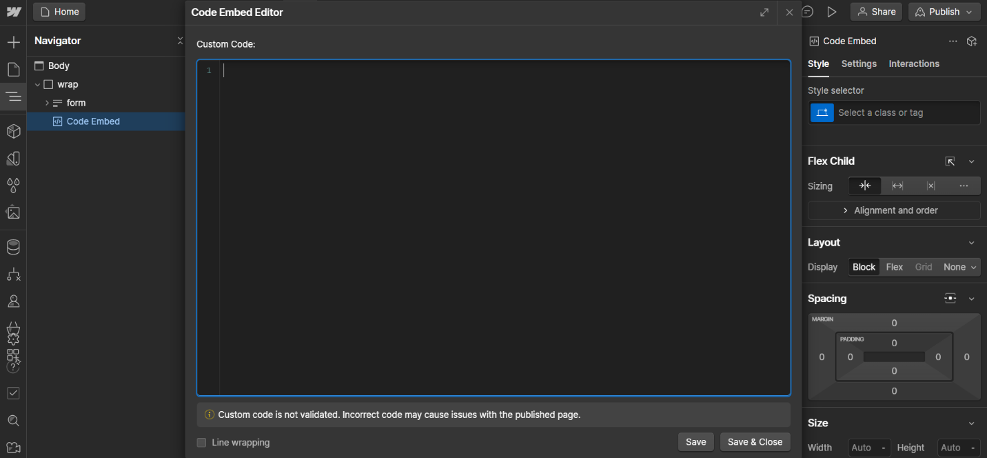
- Insert the Embed Code:
Click on the Embed element you just added to open the custom code editor. Paste the embed code you copied from Atlist into this editor. Click “Save & Close” to apply the changes.
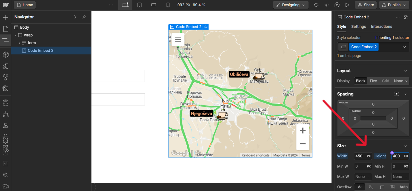
- Adjust Map Size and Style:
You might need to adjust the size and styling of the embed element to fit your design. Use the settings in Webflow to resize the element, or add custom CSS to ensure the map displays correctly and responsively on different devices.
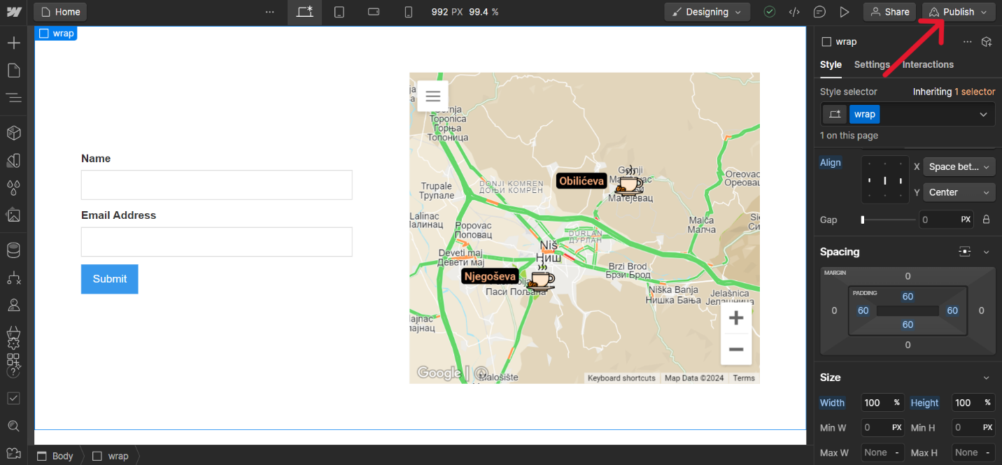
- Publish Your Site:
After embedding and adjusting the map, publish your Webflow site to see the changes live. Navigate to the published page to ensure the map is displaying as expected.
- Interactive and Responsive Features:
One of the advantages of using Atlist maps is their interactivity. Ensure that the interactive features, such as clickable markers and pop-ups, work seamlessly on your Webflow site. Test the map on various devices to confirm its responsiveness and usability.
- Ongoing Updates:
Any changes you make to your map in Atlist will automatically reflect on your Webflow site, as the embed code links directly to your live map. This means you can continually update and manage your map in Atlist without needing to re-embed the code each time.
By following these steps, you can effectively embed and manage an Atlist map within your Webflow project, enhancing the functionality and interactivity of your website. Whether for business, personal, or creative purposes, integrating Atlist maps with Webflow provides a powerful tool to engage your audience and provide valuable information visually.
Conclusion
Integrating custom maps into your Webflow website has never been easier or more powerful, thanks to Atlist. Whether you're a business owner looking to showcase multiple locations, an event planner organizing a series of venues, or a creative professional wanting to enhance your digital content, Atlist provides the tools to create visually stunning and highly functional maps.
By following the steps outlined in this guide, you can seamlessly embed your personalized maps into your Webflow projects, ensuring that your site not only looks professional but also provides an engaging user experience. From customizing map markers and overlays to embedding your map into Webflow, each step enhances the value and usability of your website.
Maps are a fundamental way to convey spatial information, and with Atlist, you have the power to make your maps as detailed, interactive, and visually appealing as your project requires. By leveraging Atlist's robust features and Webflow's design capabilities, you can take your mapping projects to the next level, making your website a comprehensive and user-friendly resource.
.png)

.png)


.png)
.png)